
Vibe Coding with Claude AI: Build a Website Without Writing Code
Most people abandon website ideas when faced with complex code. Vibe coding with Claude AI solves this. Describe your website in plain English and Claude turns your words into real code. You never touch a line. No HTML confusion, no CSS headaches. Just talk and Claude builds.
The process is simple. Give clear instructions. Claude generates the code. Review it in your browser. Request changes if needed. Done.
This guide provides ready-to-use prompts for every website phase, from a blank page to a site with inner pages, forms, mobile-friendly design, and polish. Copy, paste, fill in your info, done.
Here’s what beginners miss: your website isn’t just practice. It’s a digital asset. A portfolio that brings clients while you sleep. A landing page that collects leads. Something that gains value long after publication.
No coding background needed. No expensive tools. Use clear prompts. Get a working product.
Let’s get started.
What Is Vibe Coding with Claude AI?
Vibe coding with Claude AI allows you to build websites and software by describing your ideas in plain English, rather than writing each line of code. You outline your requirements, and tools like Claude AI generate the necessary HTML, CSS, and JavaScript to produce a functional result.
Andrej Karpathy introduced the concept of “vibe coding” in 2025. Instead of writing code line by line, you describe the desired outcome, specifying the website’s appearance, behavior, and user experience. The AI then translates your vision into code.
This approach shifts your role from learning every technical detail to guiding the process. You provide instructions, review the output, test it, and request improvements, creating a continuous loop: describe, generate, review, and refine.
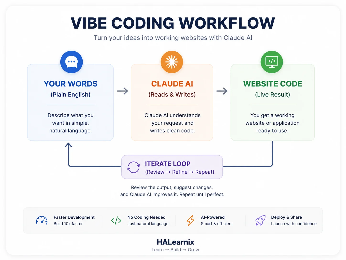
Claude is especially effective for vibe coding because it understands intent and context. It follows detailed instructions, maintains project structure across steps, and generates clean, readable code. By reviewing and adjusting this code, you learn how real projects are built.
Another key advantage is speed. Tasks such as building a landing page or structuring a portfolio site can now be completed in minutes. You can quickly test ideas, make changes, and improve designs without being delayed by technical errors or setup issues. This streamlines experimentation and project completion.
It is important to remain realistic. Vibe coding with Claude AI does not eliminate the need for critical thinking or testing. The AI provides a strong starting point, but you must still check responsiveness, resolve minor issues, and ensure proper functionality. Think of Claude as a fast junior developer whom you direct.
In simpleIn summary, vibe coding with Claude AI does not eliminate coding entirely. Instead, it lowers the barrier to getting started and offers a faster, more practical way to build, learn, and turn ideas into digital projects.
What You Can Build with Vibe Coding and Claude AI
Vibe coding with Claude AI is useful for more than just small experiments or practice projects. When you describe what you need in plain English, you can build digital assets that solve real problems, connect with people, and create lasting value.
You can create a wider range of websites with simple prompts than most beginners expect. Claude AI can help you build anything from single-page sites to complex multi-page platforms with working forms and interactive features.
Before you start, remember that your role is active in this process. Instead of just watching, you shape the project by giving vision, structure, and direction, while Claude AI handles the technical side. Working together this way makes vibe coding more efficient and effective.
Next, you’ll see four types of websites that beginners often build with vibe coding and Claude AI. Each one has the potential to become a valuable long-term digital asset.
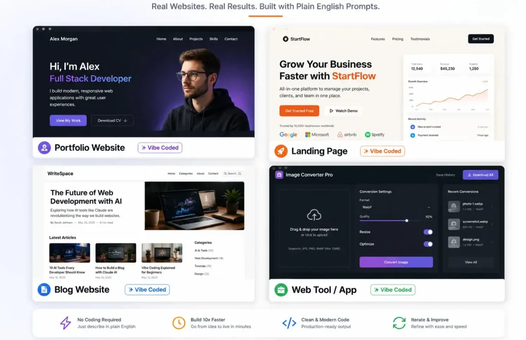
Personal Portfolio Website
Start with a portfolio website. It is the simplest way to show who you are and what you can do. You do not need anything fancy. Just a place online that proves your skills and your work.
Freelancers use portfolios to get clients without sending cold emails. Students use them to stand out when applying for jobs or university. Professionals use them to show they know their field.
A solid portfolio has a few key parts: an about section with your story, a gallery of your work, a list of your skills, and some feedback from people you have worked with. Add a contact form so people can reach you.
Prompt:
Act as a senior frontend developer and UI/UX engineer. Your task is to build a premium, production-ready personal portfolio website for a graphic designer. The implementation must use only semantic [html]5, modern [css]3, and Vanilla [script] — absolutely no frameworks. The overall goal is to create a clean, high-end, modern dark-themed portfolio that effectively showcases the designer’s work and drives contact inquiries.

The website must include the following sections, each carefully designed. First, a [hero] section featuring the designer’s name as an [h1] heading, a one-line tagline, a clear call-to-action [button], and a subtle animated background. Next, an [about] section with a short bio and a profile [img] arranged in a responsive two-column layout. Then, a [projects] section built as a 4-item [css] Grid gallery where each project card contains an [img], a title, and a short description; these cards must have smooth hover effects including zoom, overlay, and elegant transitions. After that, a [skills] section displaying 5–6 animated progress bars that visually show percentage values. There must also be a [testimonials] section presented as a responsive carousel that auto-slides and includes manual navigation controls. Finally, a [contact] section with a validated [form] containing fields for name, email, and message, along with success feedback after submission and clearly visible social links. A minimal [footer] completes the layout.

The entire design must adhere to a dark minimalist style. Use a deep slate background with #3B82F6 as the sole accent colour. Typography must be clean and sans-serif. Apply soft shadows, consistent spacing throughout, border-radius values between 12px and 16px, and smooth 0.3-second transitions on interactive elements. The site must be fully mobile-first responsive, with dedicated breakpoints at 600px, 768px, and 1024px. Accessibility is essential: use proper heading hierarchy, [label] all [form] inputs, and ensure a logical structure. Focus on fast performance, clean and modular code, and clear comments throughout the files. The final deliverable must consist of three complete files — [index.html], [styles.css], and [script.js] — with no unnecessary complexity.
Business Landing Page
A landing page does one thing. It turns visitors into people who take action. That action could be booking a call, signing up for your newsletter, making a purchase, or downloading something useful. If you run a local business, offer services, or work as a coach, a landing page is a simple way to find new clients online.
A landing page is not a full website. It focuses on one offer. No extra pages. Every part of the page points visitors to a single action. Fewer distractions mean more people do what you want.
With vibe coding, you list the sections you want. Claude builds the page. You see results fast. Test how things work and change the text as you go. What used to take days now takes hours. A good landing page keeps bringing in new leads. Share it in ads. Post it on social media. Keep improving it. Focused landing pages often get two or three times more signups than a basic homepage. Build one for your next project.
Landing Page Prompt:
Act as a senior frontend developer and conversion-focused UX writer. Build a complete, production-ready landing page for a business coach selling a 90-day mentorship program. Return exactly three files: [index.html], [styles.css], [script.js]. Keep code clean, well-commented, and ready to run locally without external libraries.

[!-- FIXED: DESIGN SYSTEM --]
Colors: --primary: #1E3A8A; --primary-hover: #1E40AF; --accent: #3B82F6; --bg: #FFFFFF; --text: #111827; --text-muted: #6B7280; --border: #E5E7EB;
Typography: System font stack. Base 16px. Scale 1.25. H1: 2.5rem (mobile) → 3.5rem (desktop). Line height 1.2 headings, 1.6 body.
Spacing: 8px baseline grid. Consistent padding/margins across sections.
Layout: Mobile-first. Breakpoints at 640px, 768px, 1024px. Use CSS Grid and Flexbox only.

[!-- FIXED: PAGE STRUCTURE & CONVERSION RULES --]
Sticky Navigation: Logo left, anchor links center, CTA right. Shrinks slightly on scroll. Mobile hamburger with smooth toggle.
Hero Section: H1 using "Result + Timeframe + Without Pain" formula. Subheadline addressing the #1 objection. Primary CTA [button] with hover state. Clean white background with subtle top gradient.
Benefits (3-Column): Icon placeholder + outcome-focused headline + 2-line description. Focus on transformation, not features.
How It Works (3 Steps): Numbered cards with connecting line on desktop, vertical stack on mobile. Clear progression language.
Pricing Table (3 Tiers): Starter, Pro (highlighted with "Most Popular" badge), Elite. Checkmark features, transparent pricing, distinct CTA per tier. No fake discounts or urgency timers.
Trust Bar: 6 grayscale logo placeholders that shift to color on hover. Ready for real SVG/PNG replacement. Proper [alt] attributes.
FAQ Accordion: 5 questions handling real objections (time commitment, experience level, ROI expectations, support access, refund policy). Smooth open/close JS. ARIA compliant.
Footer: 2-column layout. Contact email, phone, social links, copyright, privacy link. Clean spacing.

[!-- FIXED: TECHNICAL & ACCESSIBILITY REQUIREMENTS --]
Semantic [html]5. Strict heading hierarchy (H1 → H2 → H3).
Vanilla [script] only. Handle nav toggle, smooth scroll, FAQ accordion.
Accessibility: aria-expanded, aria-controls, visible focus states, contrast ratio ≥ 4.5:1, keyboard navigable.
Performance: [loading="lazy"] on all images, minimal DOM depth, clean indentation, no inline styles.
Conversion Placement: CTA appears above fold, after benefits, after pricing, and in footer. [button] copy: action-oriented ("Apply for Mentorship", "Start Your 90-Day Shift").

[!-- FIXED: OUTPUT FORMAT --]
Return code in three clearly labeled blocks: [index.html], [styles.css], [script.js]. Add a 3-line setup guide at the top. Comment key sections. Do not explain basics unless asked. Keep response tight and production-ready.
Blog or Content Site
A blog is a website filled with articles, guides, and tutorials. You can earn money by showing ads, affiliate links, sponsored posts, or by selling your own digital products.
A blog gets more valuable the longer you work on it. An article you write today can show up in Google searches for years. Social media posts fade fast, but blog posts keep working for you. Each new article brings in more readers without extra cost.
With vibe coding, you can build the whole site in one go. The homepage, article pages, categories, sidebar, header, and footer are all set up for you. Just add your content and publish when you are ready.
A blog with steady visitors is a real asset. Many people miss this. Sites with regular traffic can sell for 20 to 40 times their monthly earnings. If your blog makes five hundred dollars a month, you could sell it for ten to twenty thousand dollars. Your content is worth real money.
Modern Blog Site Prompt:
Build a high-performance, SEO-optimized [blog] website designed specifically for long-form reading and content authority, acting as a senior frontend developer with deep UX, typography, and performance expertise. The homepage should include a featured hero grid (3-column layout) highlighting top [article]s with [img], title, category tag, and reading time, followed by a dynamic category filter bar ([script]-powered) that updates posts without reload. Add a right [sidebar] containing a [search] [input] with live filtering, a “Recent Posts” widget, and a high-converting newsletter signup box with validation and success feedback. The single post page must be optimized for readability with a centered content container (max-width 800px), excellent line height and spacing, and a sticky table of contents [sidebar] that highlights active [section]s on scroll. Include an author bio box with [img], short credibility text, and social links, a related posts [section] based on category/tag logic, and lightweight social share [button]s. Design system: minimal, distraction-free UI with off-white background (#FAFAF9), deep black text (#0F172A), subtle borders (#E5E7EB), and soft hover interactions; use a clean font pairing (serif for headings, sans-serif for body) optimized for long reading sessions. Ensure full responsiveness, fast loading (lazy loading images, minimal JS), semantic [html]5 structure, accessibility ([aria] labels, contrast compliance), and clean, modular [css]. Output should feel like a production-ready [blog] template suitable for scaling into a content platform.
Simple Web App or Interactive Tools You Can Build Without Coding
A good web tool fixes a real problem. That is what brings people back. Think about calculators, converters, generators, or checkers. Each one does a single job, making life simpler. For example: a BMI calculator, a currency converter, a resume builder, a color palette generator, or an SEO meta tag creator.
Web tools pull in backlinks. Blogs and landing pages rarely receive the same level of attention. If your tool solves a real problem, people will share it on their sites, in forums, and in newsletters. Each link builds trust with Google. Over time, your site can climb higher in search results.
With vibe coding, you explain what you want the tool to do and how it should look. Claude handles the logic, input fields, calculations, and output. You test what it builds. Make changes until it works the way you want. In the end, you get a real tool that people can use right away.
One simple tool can bring in thousands of visitors each month from search. You do not need to pay for ads. Tools also work well as lead magnets. Offer your tool for free. Collect email addresses. Later, share useful products or services with your audience.
Create Interactive Tools Prompt:
Build a production-ready BMI calculator web tool as a senior frontend developer focused on UX, performance, and shareability. Create a clean, centered layout with a responsive card design containing clearly labeled [input]s for height (cm/ft toggle) and weight (kg/lbs toggle), real-time unit conversion, and inline validation with helpful error messages. Add a prominent “Calculate BMI” [button] with a subtle loading state, then display results inside a visually highlighted output card that includes the BMI value, category (underweight, normal, overweight, etc.), color-coded status indicator, and a short health explanation. Include a reset [button] and a collapsible “How It Works” [section] explaining the formula in simple terms. Enhance interactivity with smooth transitions, micro-interactions, and keyboard accessibility. Add social sharing [button]s (copy link, WhatsApp, Twitter/X) and an automatic embed code generator ([iframe] snippet) so other sites can easily integrate the tool. Follow a mobile-first design with large touch-friendly controls, fast load time, semantic [html]5, clean modular [css], and lightweight vanilla [script]. Ensure accessibility ([aria] labels, contrast compliance) and output a polished, scalable tool suitable for real-world use and content monetization.
How to Vibe Code with Claude AI (Complete Step-by-Step)
This is where you start building your website. You have the idea. Now it is time to put it into action with real prompts and a simple workflow.
Vibe coding with Claude AI works in six clear phases. Each one has a job. You are not just telling the AI to build a website and hoping for the best. You guide it step by step, the same way you would help a junior developer.
Here is how to do it right.
Open a new chat for your project. Keep everything in that one conversation. Claude will remember your design, structure, and choices as you go. That context keeps your results clear and consistent.
Each phase comes with a focused prompt. Copy it, paste it into Claude, fill in your details, and run it. Check the output before you move on. Take your time. Do not skip steps.
This workflow is not just theory. According to recent data from daily.dev, Developers everywhere now use AI tools every day. A lot of real code is written with AI help. The difference here is you can do it too, even if you are just starting out.
Follow these six phases in order. You will go from a blank idea to a real, launch-ready website. No getting stuck. No feeling lost.
Now let’s build, step by step.
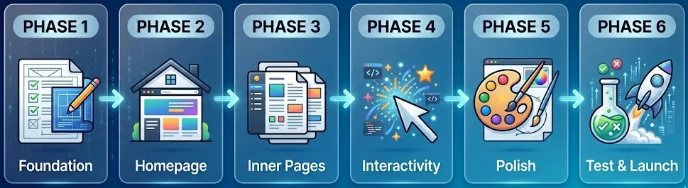
Phase 1: Set Up Your Project Foundation
Give Claude the right context before you ask for anything. Most people skip this step and end up stuck, repeating themselves and getting nowhere.
Claude works best when it knows three things: what you want to build, who it is for, and how you want it to look and feel. If you skip this, every prompt feels like starting over. If you set it up right, each step gets easier.
Start From The Phase 1: Open a new chat in Claude. Start with a simple message that explains your project. This first message sets the direction for everything that follows.
Start Your Project Prompt:
Imagine you are helping a beginner build a real website from scratch. The intention is clear: create a [type of website] for [target audience] that focuses on one main goal, such as selling, informing, or generating leads. Before you touch any code, take time to understand what the project needs. Take me through the process like you would if we were working side by side.

[!-- FIXED: Project Vision --]
Website type: [portfolio / business / blog / SaaS landing / tool]
Target audience: [describe users, their intent, and expectations]
Core goal: [conversion, leads, branding, education, etc.]
Key pages required: [Home, About, Services, Blog, Contact, etc.]

[!-- FIXED: Design System & Feel --]
Style direction: [modern / minimal / bold / premium / playful]
Primary color: [hex code]
Secondary/support colors: [optional]
Typography: [clean sans-serif / elegant serif / mixed pairing]
UI feel: [subtle shadows / flat design / glassmorphism / high contrast]
Layout preference: [grid-based / card-based / full-width sections]

[!-- FIXED: Functional Requirements --]
Fully responsive (mobile-first)
Fast loading, clean structure
Contact [form]s (with validation)
Basic interactivity (hover effects, smooth scrolling)
SEO-friendly semantic [html] structure

[!-- FIXED: How to get started --]
Hold off on writing any code for now.
Start by mapping out the full website structure. List out the main [section]s, how they connect, and the flow for users.
If you find any missing pages, features, or UX ideas, point them out.
Check that the design feels the same on every page.
Ask any important questions before we start building.
Think and plan like an expert, not just someone following instructions. Once the structure looks good, we will build each part together, step by step.
Phase 2: Build Your Homepage Structure
Your homepage is crucial. It sets the tone, shows your value, and decides if visitors stay or leave in three seconds.
In Phase 2, build the page section by section. This rule is critical. One section per prompt lets Claude produce focused, clear output. Building everything into a single prompt yields messy, generic results.
The Full Website Homepage Master Prompt:
We are now ready to build the complete homepage structure. Act as an expert UI/UX developer. Generate the full, production-ready [html] file using Tailwind CSS via CDN and Vanilla [script].

Build the page following this exact top-to-bottom architecture:
[!-- FIXED: Hero Section --] Full viewport height (min-h-screen), center-aligned content. Headline: [Your Main Benefit Headline]. Subheadline: [One sentence explaining the value]. Primary CTA [button]: [Main Action Text]. Secondary Text Link: [Secondary Action].
[!-- FIXED: Social Proof Bar --] A subtle horizontal banner directly below the hero. Include a trust metric like 'Trusted by [Number]+ users' and 4 clean placeholder logos.
[!-- FIXED: Features Section --] A modern 3-column [grid] layout using cards. Detail 1: [Feature 1]. Detail 2: [Feature 2]. Detail 3: [Feature 3]. Include generic SVG icons for each.
[!-- FIXED: How It Works --] A clean, numbered 3-step process [section]. Step 1: [First Action]. Step 2: [Second Action]. Step 3: [Result].
[!-- FIXED: Testimonials --] A 2-column or 3-column [grid] featuring simple placeholder reviews. Include 5-star icons and subtle hover animations on the cards.
[!-- FIXED: Final CTA Section --] A bold, distinct background color block. Headline: [Your Closing Pitch]. Big [button]: [Final CTA Text].
[!-- FIXED: Footer --] Minimalist dark or light footer. Include basic placeholder links for About, Contact, Privacy Policy, and copyright year.

[!-- FIXED: UI/UX Strict Rules --]
Ensure ample whitespace padding between every [section] (use py-16 or py-24).
Add smooth hover state transitions to all [button]s and links.
The entire layout must be perfectly mobile-responsive first.
Output the complete code block so I can preview the live rendering.
Phase 3: Build and Structure All Core Inner Pages
With your homepage done, repeat this process for each additional website page. Each gets its own session or clear, separate prompt.
Claude gets you from 0 to 80% fast. The speed is most obvious on inner pages. Claude produces a full About, Services, or Contact page in minutes, tasks that would take a developer half a day to complete.
Build Your All Core Pages Prompt:
"Act as a UI/UX expert. Build the About Us page using the exact Tailwind design system, colors, and fonts established on our homepage. Architecture:
Clean hero [header] with the page title.
A 2-column 'Our Story' [section] featuring text on the left and a placeholder [img] on the right.
A 'Core Values' 3-column [grid] with simple SVG icons and short text.
A 'Meet the Team' [section] with 3 profile cards (photo placeholder, name, title).
A strong call-to-action banner linking to the Contact page.
Ensure consistent spacing (py-16) and strict mobile responsiveness."

[!-- FIXED: The Services or Offerings Page Master Prompt --]
This page explains exactly what you offer and what the user gets. It requires a high-converting layout with incredibly clear deliverables.
"Build the Services page maintaining the exact visual style and Tailwind CSS classes from our homepage. Architecture:
Minimal introductory hero [section].
A 3-column service card [grid]. Each card must include: a service title, a 3-line description, a vertical list of 4 deliverables with checkmark SVG icons, and a primary 'Get Started' CTA [button].
Add a slight lift hover effect to the service cards.
Finish with a bottom CTA [section].
Ensure the cards stack vertically on mobile screens."

[!-- FIXED: The Contact Page Master Prompt --]
A broken contact [form] completely ruins your professional image. This prompt forces the AI to build a functional layout and includes the [script] needed to validate user [input].
"Build the Contact page using our established Tailwind CSS design system. Layout: A split 2-column [grid].
Left side: A clean contact [form] with fields for Name, Email, Subject, and Message, plus a primary submit [button].
Right side: Text blocks for our email address, physical location, and 3 social media icons.
Technical requirement: Write Vanilla [script] to add simple [form] validation. The [form] must show a visual error if a user tries to submit empty fields.
Ensure the columns stack cleanly on mobile devices."

[!-- FIXED: The Essential Legal Pages (Crucial for Monetization) --]
If you plan to keep your content free by using Google AdSense, you must include a Privacy Policy and Terms of Service. Google requires this for approval.
You do not need a complex design here. Just ask Claude to generate a clean, text-focused layout.
Use a simple prompt: "Create a minimalist, text-focused [html] layout for a Privacy Policy using a narrow, readable container and our homepage fonts."
Phase 4: Add Interactive Features and Functional Enhancements
A static website just displays information. An interactive website lets people click, type, and get feedback. In Phase 4, your site moves beyond a simple brochure. Now it feels like something people can actually use.
Some tools let you connect your project to an MCP server. This makes Claude even more helpful, almost like having a coding partner. But you do not need any special setup to add interactivity. Claude can write the JavaScript you need, right inside your project.
Add Advanced Features and Functional Functionality Prompt:
Act as a senior frontend developer specializing in UI/UX interactions, performance, and clean [script] architecture. Your task is to enhance my existing website by adding high-quality interactive features and functional improvements using lightweight, scalable, and production-ready code. All features must follow my existing design system (colors, typography, spacing, [button] styles) and remain fully responsive across mobile, tablet, and desktop.

Below are advanced interaction modules. Each can be used as a standalone prompt. Replace placeholders where needed.

Add a responsive, sticky navigation system that improves usability and mobile experience. On desktop, display a horizontal menu with clearly spaced links and an active state indicator. On mobile, implement a hamburger menu that opens a full-screen overlay navigation with smooth slide-in animation. Include features such as active-page highlighting, scroll lock when the menu is open, and smooth transition effects. Style must match: [your color scheme, font, spacing]. Ensure accessibility with keyboard navigation and ARIA labels.

Create a dynamic FAQ accordion [section] designed for clarity and engagement. Include [number] questions. Each item should expand/collapse smoothly when clicked. Only one item remains open at a time. Add a rotating icon (+ to ×) to indicate state change. Include subtle animation and proper spacing for readability. Content should be easy to scan and mobile-friendly.

Build an interactive image gallery with lightbox functionality. Display [number] images in a responsive [grid] ([columns] layout on desktop, stacked on mobile). When clicked, open a full-screen lightbox overlay with the selected [img], a close [button], and navigation arrows (next/previous). Add keyboard navigation support (arrow keys + ESC to close). Include smooth transitions and optimized [img] loading.

Enhance the contact [form] with advanced validation and feedback system. Required fields: [name, email, message, etc.]. Validate [input]s in real time (empty fields, correct email format). On submission, show a loading state ([spinner/text]). After success, display a confirmation message: “[custom message]”. Reset the [form] automatically. Ensure error messages are clear and positioned correctly. Maintain accessibility standards.

Implement scroll-based animations to improve visual flow. Use the Intersection Observer API to trigger animations when elements enter the viewport. Each [section] should fade in and move upward ([distance, e.g., 20px]) with a slight stagger delay ([timing]). Keep animations smooth and subtle—avoid performance-intensive effects. Allow easy adjustment of animation speed and timing.

Add smooth scrolling behavior and a back-to-top feature for better navigation. Enable smooth scroll for all anchor links. Include a back-to-top [button] that appears after scrolling [X pixels]. Position it fixed at the bottom-right corner. Style: [shape, color, icon]. Add fade-in/out animations and ensure they work across all devices.

Global Requirements:
Use Vanilla [script] only (no unnecessary libraries)
Keep code clean, modular, and well-commented
Ensure fast performance and minimal load impact
Maintain full responsiveness and accessibility
Match the existing UI design system exactly
Phase 5: Design Refinement and Professional UI Polish
Most vibe coders skip this step. That is why their sites look AI-generated. Phase 5 is where you turn a working site into something that feels like a real designer made it.
The real difference between an amateur site and a polished one is not the layout. It is the details. Clean spacing, readable fonts, smooth hover effects, and colors that work together across every part of the page.
Advance Modern Design Prompt:
Act as a senior UI/UX designer and frontend engineer with a focus on visual systems, consistency, and production-ready polish. Your task is to refine and elevate the entire website design to a professional, launch-ready standard. Do not rebuild, audit, improve, and enhance every visual and interaction detail while strictly maintaining the existing layout structure and branding direction.

Below are advanced design refinement modules. Use them as prompts. Replace placeholders where needed.

Refine the entire typography system across the website. Establish a clear, consistent hierarchy: [h1] ([size]), [h2] ([size]), [h3] ([size]), body text ([size]) with optimal line-height ([value]) for readability. Apply a professional font pairing: [primary font] for headings and [secondary font] for body text, imported from Google Fonts. Ensure consistent font weights, spacing, and alignment across all sections. Remove any mismatches in size or inconsistent styles.

Conduct a full spacing and whitespace audit to improve layout clarity and visual breathing room. Apply consistent vertical padding to all major sections ([value, e.g., 80px]). Standardize internal spacing: card padding ([value]), grid gaps ([value]), and section margins. Fix any crowded or uneven layouts. Ensure all elements align to a consistent grid system. The goal is a clean, balanced, and easy-to-scan interface.

Enhance hover states and micro-interactions across all interactive elements. Add smooth transitions ([timing, e.g., 0.2s–0.3s ease]) to [button]s, cards, and navigation links. [button]s should have subtle color shifts or scale effects. Cards should lift slightly with soft shadows. Navigation links should include an animated underline or color transition. Ensure all interactions feel responsive, modern, and consistent.

Execute a color system consistency check across the entire UI. Enforce strict usage of brand colors:
Primary color: [hex] ([button]s, key actions)
Secondary color: [hex] (secondary actions)
Accent color: [hex] (icons, highlights, links)
Identify and fix any inconsistencies. Ensure proper contrast ratios for accessibility (WCAG standards). Maintain a cohesive visual identity across all pages.

Implement favicon, browser identity, and SEO meta basics. Create a clean favicon using [initial/icon] with [foreground color] on [background color]. Update the browser tab title to: “[Site Name], [Tagline]”. Add a concise [meta] description optimized for search engines. Ensure consistency with branding and improve first impression in browser tabs and search results.

Global Requirements:
Maintain full design consistency with the existing system.
Keep everything responsive (mobile-first)
Use clean, maintainable CSS.
Follow accessibility best practices (contrast, readability, focus states)
Avoid overdesign, keep it minimal, professional, and intentional.
Phase 6: Final Testing, Debugging, and Launch Preparation
Your website looks good. Now check that it works everywhere. Test it on your phone, your laptop, and any other devices you have. Do this before anyone else visits.
Next, do a quick check yourself. Click every button. Try every feature. Make sure things work the way you expect. Claude AI gets you most of the way there, but you are the final tester. The AI builds. You make sure it works.
Final Code Testing Prompt:
Act as a senior QA engineer, frontend performance expert, and technical SEO specialist. Your task is to perform a complete pre-launch audit of my website and ensure it is fully responsive, error-free, fast-loading, SEO-optimized, and ready for real users. Do not give generic advice — analyze, identify issues, and provide exact fixes where needed.

Start with a mobile responsiveness test. Simulate screen sizes from full desktop down to 375px (mobile). Carefully check for layout breaks such as overflowing text, broken [img] scaling, misaligned [section]s, [button]s that are too small to tap, and navigation issues. If problems exist, fix them with precise CSS adjustments. Ensure all interactive elements have a minimum tap target size of 44px and layouts stack cleanly on smaller screens.
Next, perform a cross-browser compatibility check across Chrome, Safari, and Firefox. Identify any inconsistencies in rendering, spacing, or CSS behavior. Fix browser-specific issues using safe, compatible CSS properties and fallbacks where necessary.

Move to performance optimization. Review the entire site for speed issues such as large images, unused CSS, render-blocking resources, and inefficient [script]s. Optimize images (compression + proper sizing), minimize CSS/JS where possible, and ensure fast load times. Target a high mobile performance score (80+). Apply practical fixes, not theoretical suggestions.
Then implement essential SEO elements across all pages. Add unique [title] tags (under 60 characters), [meta] descriptions (under 155 characters), proper [h1] structure, descriptive [alt] text for all images, and Open Graph tags for social sharing. Ensure each page targets a specific keyword and follows clean semantic [html] structure.

Run a basic accessibility audit. Ensure all images include meaningful [alt] text, all [form] [input]s have properly linked [label]s, color contrast meets WCAG AA standards, and every interactive element is accessible via keyboard navigation. Fix any issues that reduce usability.

Finally, complete a full pre-launch checklist review: verify all internal and external links work correctly, confirm the contact [form] submits and shows success feedback, ensure mobile layouts are clean across key breakpoints (375px, 414px, 768px), check that all images are optimized, remove any placeholder text, confirm social links open correctly, and ensure a tracking tool like Google Analytics is properly integrated.

Your goal is to transform this website from “almost ready” to fully polished, technically sound, and launch-ready with zero critical issues remaining.
Top Vibe Coding Prompts for Claude AI (Copy & Use It)
Each of these six prompts works on its own. You do not need to follow them in order.
Every prompt gives you a finished result.
Just copy a prompt, paste it into Claude.ai, add your details, and press enter.
Prompts work best when you give clear details about design, style, and what you want. According to prompt engineering research from Anthropic, prompts that include specific design dimensions, reference styles, and explicit constraints produce 40-60% better visual output than generic requests.
Pick one and start building.
Prompt 1: Complete Portfolio Website
This is the starter project most people ask for. Use this prompt to build a real personal portfolio with multiple sections. The result is something you can actually use, not just a sample layout.
This is for freelancers, designers, developers, writers, photographers, consultants, or anyone who wants a professional website.
HALearnix - Build Personal Portfolio Website Prompt:
ROLE:
You are a senior front-end developer, UX designer, and conversion strategist. Your goal is to build a premium personal portfolio website that not only looks professional but converts visitors into clients or opportunities.

MY DETAILS
• Name: [YOUR FULL NAME]
• Profession/Title: [e.g., UI/UX Designer / Web Developer / Copywriter]
• Target clients: [who you want to attract]
• Primary goal: [get clients / freelance work / job offers / authority building]
• Unique value proposition: [1 clear sentence — what makes you different]

CONVERSION GOALS (CRITICAL)
• Every section must guide users toward action
• Primary CTA: [Hire Me / Start a Project / Book a Call]
• Secondary CTA: [View Work / Download CV]
• Place CTAs strategically:

Hero section
Mid-page (after projects)
Final contact section
• Build trust + clarity before asking for action

DESIGN SYSTEM (STRICT)
• Style: [minimalist-dark / modern-clean / bold-creative / premium-corporate]
• Primary color: [HEX]
• Accent color: [HEX]
• Background: [light / dark / gradient]
• Typography:

Heading font: [suggest premium Google Font]
Body font: [clean readable font]
• Use consistent 8px spacing system
• Use CSS variables for colors, fonts, spacing

IMPORTANT: Design must feel human-crafted, clean, and modern — NOT generic AI output.

WEBSITE STRUCTURE (BUILD IN THIS ORDER)

SECTION 1: STICKY NAVIGATION
• Logo/name on left, menu on right
• Links: Home | About | Work | Skills | Testimonials | Contact
• Sticky header with smooth background transition on scroll
• Active link highlight
• Smooth scroll between sections
• Mobile: hamburger → full-screen animated menu

SECTION 2: HERO (HIGH-CONVERSION)
• Full viewport height layout
• Headline: strong, benefit-driven (no generic text)
• Subheadline: what you do + who you help
• CTA buttons: Primary (filled) + Secondary (outline)
• Trust signal line: "Trusted by [type of clients]"
• Visual: Animated gradient/abstract background + Avatar or illustration placeholder
• Add subtle entrance animation

SECTION 3: ABOUT (TRUST BUILDING)
• Two-column layout (image + content)
• 3 short paragraphs: Background story | Work approach | Value for clients
• Stats row: [X]+ Projects | [X]+ Clients | [X]+ Years Experience
• CTA: "Let's Work Together"

SECTION 4: FEATURED PROJECTS
• 3–6 project cards (responsive grid)
• Each card includes: Image (16:9) | Title | 2-line result-focused description | Tech stack tags (badges) | CTA: "View Case Study"
• Hover effect: Image zoom + overlay + CTA
• Optional filter tabs (All / Web / Design / etc.)
Focus on RESULTS, not just visuals

SECTION 5: SKILLS & EXPERTISE
• Choose best layout automatically: Skill bars (for developers) or Visual cards/bubbles (for creatives)
• Include categories | Animate on scroll | Keep layout clean and readable

SECTION 6: TESTIMONIALS
• Carousel (auto-play + manual control)
• Each card: Client quote | Name + role | Avatar | Star rating
• Pause on hover | Subtle animations

SECTION 7: CONTACT (LEAD CAPTURE)
• Two-column layout
• LEFT: Short persuasive message | Email, location, availability | Green status indicator (Available)
• RIGHT: Contact form fields (Name, Email, Project Type dropdown, Budget dropdown, Message)
• Validation: Required fields | Email format check
• On submit: Show loading state (1–2 sec) → Show success message
Optimize for maximum conversions

SECTION 8: FOOTER
• Social icons (LinkedIn, GitHub, etc.) | Quick navigation links | Copyright (auto year via JavaScript) | Back-to-top button (appears on scroll)

INTERACTIONS & ANIMATIONS
• Smooth scrolling | Scroll-triggered fade-up animations | Button hover effects | Card hover lift effect | Lazy loading for images

RESPONSIVENESS (MANDATORY)
• Mobile-first design
• Breakpoints: 375px (mobile) | 768px (tablet) | 1024px+ (desktop)
• Touch-friendly UI elements

TECHNICAL REQUIREMENTS
• Use [html]5 + [css]3 + Vanilla [script] only
• No frameworks (no Bootstrap, Tailwind, etc.)
• Clean, structured, well-commented code
• SEO basics: Proper heading hierarchy | [alt] text for images
• Optimized for performance

OUTPUT FORMAT
• Provide complete working code in separate files: [index.html] | [style.css] | [script.js]

FINAL INSTRUCTION:
Confirm understanding of the project
Suggest 2–3 improvements
Then generate full production-ready website
Try these follow-up prompts next.
- “Change the hero background to a dark navy with a subtle animated dot grid pattern.”
- “Make the project cards open a modal with a full case study layout when clicked.”
- “Add a dark/light mode toggle to the navigation bar.”
Prompt 2: Business Landing Page
If you need a one-page sales page, start here. This is for a single landing page, not a full website. The goal is simple: turn visitors into leads or customers. It works well for coaches, freelancers, SaaS founders, local businesses, or anyone sending traffic to a focused offer.
You get a full landing page that guides visitors step by step. First, grab attention. Then build trust. Finally, make it easy to take action. The page includes a strong headline, clear benefits, proof from real people, pricing or offer details, answers to common questions, and several call-to-action buttons. Each part helps the visitor decide. The result is a page that looks good and gets results.
Biuld A Professional Landing Page (HALearnix Master Version Prompt):
ROLE:
You are a senior front-end developer, UX designer, and conversion strategist. Your task is to build a premium landing page that is visually clean, fast, and engineered to convert visitors into leads or customers.

BUSINESS / OFFER DETAILS
• Business name: [YOUR BUSINESS NAME]
• Product/Service: [What you sell]
• Target audience: [Who this is for — be specific]
• Main promise: [Clear outcome — e.g., "Get X result in Y time"]
• Primary conversion goal: [Book a call / Buy now / Sign up]
• Price point: [X/StartingatX / Free consultation]

CONVERSION STRATEGY (CRITICAL)
• Page must follow: Attention → Trust → Desire → Action
• Primary CTA: [Main action text]
• Secondary CTA: [Lower commitment action]
• CTA must appear:

• Above the fold
• Mid-page
• Final section
Add urgency: "Limited spots" | "Only X remaining"
Build trust BEFORE asking for action

BRAND & DESIGN SYSTEM
• Brand personality: [professional / bold / friendly / premium]
• Style reference: [e.g., "like Stripe" / "like Airbnb"]
• Primary color: [HEX]
• Accent color: [HEX]
• Background: [light / dark / gradient]
• Typography:
Heading font: [premium Google Font]
Body font: [clean readable]
• Use consistent 8px spacing grid
• Use CSS variables for all styles

IMPORTANT: Design must feel human-crafted, modern, and premium — NOT generic AI output.

LANDING PAGE STRUCTURE (BUILD IN ORDER)

STICKY NAVIGATION
• Logo left, nav links center (Features, Results, Pricing, FAQ)
• CTA button right (primary color)
• Sticky with background + shadow after scroll
• Mobile: hamburger → smooth dropdown/fullscreen menu

HERO SECTION (ABOVE THE FOLD)
• Full viewport height
• Attention badge: "[X] clients helped"
• H1: bold, outcome-driven headline (6–8 words)
• H2: supporting credibility sentence
• 3 benefit bullets with icons
• CTA buttons: Primary (large) + Secondary (text/outline)
• Trust micro-signals: Rating / guarantee / free call
• Background: gradient / geometric / abstract
• Optional hero visual (mockup or illustration)

SOCIAL PROOF BAR
• "Trusted by..." headline
• 5–6 logo placeholders
• Mobile: scrollable

PROBLEM SECTION
• Relatable headline ("Sound familiar?")
• 3 pain-point cards: icon + short headline + 2 lines
• Slight visual contrast (light/dark tone)
• Bridge line → solution

SOLUTION / ABOUT
• Two-column layout
• Left: image placeholder
• Right: Headline "Here's how [Business Name] helps" | 2–3 short paragraphs | Credentials (icon + text)
• Build authority + clarity

HOW IT WORKS (PROCESS)
• 3-step horizontal process
• Each step: number + icon + title + short explanation
• Connected visually | CTA button below

FEATURES / BENEFITS
• 6 feature cards (3×2 grid)
• Each: icon | title | benefit-focused description
• Hover effect: lift + shadow

RESULTS / TESTIMONIALS
• 3 testimonial cards: quote | name + role | avatar | star rating | result metric (bold)
• Stats row: e.g., "100+ Clients | 95% Success | $X Generated"
• Optional animation on numbers

PRICING / OFFER
Option A — Pricing Table:
• 3 tiers (Basic / Pro / Premium)
• Middle = "Most Popular"
• Features list + CTA per plan

Option B — Single Offer:
• Price + value breakdown
• What's included (4–6 bullets)
• Urgency element | Guarantee line

FAQ SECTION
• 6–8 questions (accordion)
• One open at a time
• Address objections: price | results | timeline | who it's for

FINAL CTA SECTION
• High-contrast background
• Strong transformation headline
• One clear CTA
• Reassurance: No credit card | Cancel anytime | Fast response

FOOTER
• 4-column layout: Logo + description | Links | Contact info | Newsletter/signup
• Legal links | Social icons | Copyright

INTERACTIONS & UX ENHANCEMENTS
• Smooth scrolling | Fade-up animations on scroll | Button hover effects | Card hover lift
• Sticky CTA (mobile bottom bar after scroll) | Lazy loading images

RESPONSIVENESS (MANDATORY)
• Mobile-first design
• Breakpoints: 375px / 768px / 1024px+
• Touch-friendly buttons (min 44px)

TECHNICAL REQUIREMENTS
• HTML5 + CSS3 + Vanilla JavaScript
• No frameworks
• Clean, commented code
• SEO basics: proper headings | alt text
• Optimized performance

OUTPUT FORMAT
• Files: index.html | style.css | (Optional: script.js if needed)

FINAL INSTRUCTION:

Confirm understanding

Suggest 2–3 improvements

Then generate full production-ready landing page
Refinement prompts:
- Add a sticky bar for mobile. It should show up after someone scrolls past the top section. Keep the call-to-action button visible and include a short reminder of your offer.
- Add a countdown timer to the pricing area. Show how many spots are left this month. The number should go down in real time as people sign up.
- Set up a pop-up that appears when someone is about to leave the page. Offer a free resource they can download if they enter their email.
Prompt 3: Blog Layout Structure
A blog drives steady visitors over time. This prompt helps you set up a blog structure in minutes, with a homepage, category pages, and a simple article layout designed for readability and search visibility.
To launch a real content platform and build your online presence, use this setup as a starting point. It’s ideal for creators, affiliate marketers, coaches, or anyone building a niche site. By using the included listing and post templates, your blog will load quickly, maintain a clean look, and help keep readers engaged through simple grids, filters, and practical widgets. This gives you both a professional appearance and a strong user focus from the start.
Blog Website Prompt FROM HALearnix | SEO-Optimized:
You are a senior front-end developer, UX writer, and SEO-focused content platform architect.

Your task is to build a complete, multi-page blog website that is optimized for:
• Long-form reading experience
• Search engine crawling (SEO structure)
• Content scalability (future growth)
• Monetization readiness (ads, affiliate, products)

This is not just a layout. This is a full blog system.

BLOG IDENTITY (FILL BEFORE BUILD)
• Blog name: [YOUR BLOG NAME]
• Niche/Topic: [e.g., AI tools / finance / health / tech]
• Target audience: [who you are writing for]
• Content type: [educational / tutorials / authority / niche site]
• Monetization goal: [AdSense / affiliate / products / mixed]

DESIGN SYSTEM (STRICT — FOLLOW THIS)
• Layout style: [minimal-reader / magazine / clean blog]
• Color system:
• Primary color: [HEX]
• Background: [white / off-white / soft gray]
• Text: [near-black for readability]

• Typography:
Body font: "Merriweather" (reading optimized)
Headings/UI: "Inter"
Line height: 1.7–1.8 (critical for readability)
Max content width: 720–800px

• UX Rules:
Clean spacing (8px grid system)
No clutter
Focus = reading first, design second
Must feel human-written platform, not AI-generated template

BUILD THESE 3 CORE PAGES
PAGE 1 → BLOG HOMEPAGE (index.html)
HEADER / NAVIGATION:
• Logo (text-based)
• Nav: Home | Categories | About | Contact | Search icon
• Sticky on scroll with subtle shadow
• Optional: Newsletter CTA button
• Mobile: hamburger → smooth dropdown

CATEGORY FILTER BAR:
• Horizontal scrollable category pills
• 6–8 categories
• Active state highlighted
• "All" filter default

FEATURED CONTENT AREA:
• 1 primary featured post (large hero card):
• Image (16:9)
• Category tag
• Title (H2)
• Excerpt (2–3 lines)
• Author + date + read time
• CTA: "Read Article"
• 2 secondary featured posts (smaller cards)

ARTICLE GRID:
• Responsive grid: Desktop: 3 columns | Tablet: 2 | Mobile: 1
• Each article card:
• Thumbnail (aspect ratio preserved)
• Category tag
• Title (H3, max 2 lines)
• Excerpt (2 lines)
• Meta row: author avatar + name + date + read time
• Hover effect: lift + image zoom

SIDEBAR (desktop right, mobile bottom):
Widgets:

About widget (photo + short bio)

Newsletter signup (email + CTA)

Search box

Popular posts (top 5)

Categories list (with counts)

Optional tag cloud

Social follow buttons

TRENDING SECTION:
• Numbered top 5 posts
• Clean horizontal layout

NEWSLETTER SECTION:
• Full-width highlight section
• Headline + subtext
• Email input + subscribe CTA
• Social proof line

PAGINATION:
• Numbered pagination (SEO-friendly)
• Prev / Next buttons

FOOTER:
• About summary | Quick links | Categories | Social icons | Copyright

PAGE 3 → CATEGORY PAGE (category.html)
• Category hero section: Name | Description | Post count
• Article grid (same as homepage)
• Pagination system

ADVANCED FEATURES (MANDATORY)
• Dark mode toggle (persistent)
• Reading progress bar
• Sticky table of contents
• Smooth scroll behavior
• Lazy loading images
• Mobile-first responsiveness

SEO STRUCTURE (CRITICAL)
• Proper heading hierarchy (H1 → H2 → H3)
• Meta tags placeholders (title, description)
• Open Graph tags
• Canonical URL placeholder
• Image alt text structure
• Clean semantic HTML5

RESPONSIVENESS
• Mobile-first approach
• Breakpoints: 375px | 768px | 1024px+
• Touch-friendly UI
• Sidebar stacks below on mobile

OUTPUT FORMAT
Provide complete working code:
• index.html (homepage)
• post.html (single article)
• category.html (category page)
• style.css (fully structured, commented)
• script.js (for interactivity)

FINAL INSTRUCTION:
Confirm understanding of blog structure
Suggest 2–3 UX or SEO improvements
Then build full production-ready blog system

RESULT: This is not just a blog template. This is a scalable content asset system: Built for SEO traffic | Optimized for reading | Ready for monetization. This is how authority websites are built.
Refinement prompts:
- Add a Save for later button to each article card. When someone clicks it, the article gets saved in the browser. Show all saved articles on a Reading List page.
- Let users click the search icon to open a search box. As they type, filter the article titles in real time.
- Show a cookie consent banner at the bottom of the page. Give people Accept and Decline buttons. Remember their choice for 30 days.
Prompt 4: Working Contact Form
Use this when you want a contact form that works and looks good. It fits right into any website or stands alone as its own page. The prompt gives you a clean, professional form that collects messages correctly.
You get a ready-to-use contact form with all the basics: different field types, input checks, and clear feedback after someone hits send. The whole page layout is included.
Contact Form Ready Prompt:
You are a senior front-end developer. Write complete, self-contained HTML, CSS, and JavaScript code for a professional "Contact Us" page section. Give me the entire code in one HTML file (inline CSS in [style], JS at the end).

GLOBAL PLACEHOLDERS (I will fill before sending):

BRAND_COLOR = #2563EB (blue-600)

COMPANY_EMAIL = hello@mywebsite.com

FORMSPREE_ENDPOINT = https://formspree.io/f/yourFormID

REQUIREMENTS:

PAGE STRUCTURE

Two-column layout on desktop (60% form left, 40% info right), stack vertically on mobile (<768px).

The left column contains the contact form.

The right column contains contact info and a response-time badge.

CONTACT INFO (RIGHT COLUMN)

Heading: "Let's talk about your project"

One friendly sentence: "Have a question or want to work together? Drop a message and I’ll get back to you fast."

Contact details with icons (use simple SVG inline icons or Unicode emojis):

Email: [COMPANY_EMAIL] (clickable mailto)

Phone: [+1 (555) 123-4567] (clickable tel)

Location: [City, Country]

Response time: "Usually within 24 hours on business days"

A small badge that says "Available for new projects" with a green dot (CSS-only pulsing effect).

Social media icon row (use simple SVG circles with letters: LI, TW, GH). No real links; use "#".

CONTACT FORM (LEFT COLUMN)
Form uses POST to FORMSPREE_ENDPOINT. No file uploads. Keep fields in this order:

Field 1: Full Name

Type: text, required

Label: "Full Name"

Placeholder: "John Doe"

Field 2: Email Address

Type: email, required

Label: "Email Address"

Placeholder: "you@example.com"

Validate proper email format on submit

Field 3: Phone Number (optional)

Type: tel, not required

Label: "Phone Number (Optional)"

Placeholder: "+1 (555) 000-0000"

Field 4: Subject

Type: select, required

Label: "Subject"

Options: "General Inquiry", "Quote Request", "Support", "Partnership", "Other"

Field 5: Message

Type: textarea, required

Label: "Message"

Placeholder: "Tell me about your project, idea, or question..."

Minimum 20 characters

Show a live character count below: "X / 500"

Field 6: Consent checkbox

Type: checkbox, required

Label: "I agree to the privacy policy and consent to being contacted."

Include a dummy link to "#privacy"

Submit button:

Full width, BRAND_COLOR background, white text, rounded (8px)

Text: "Send Message →"

On click: disable button, show spinner, text "Sending..."

VALIDATION (on submit, not on every keystroke)

If required fields are empty → red border on input, red error message directly below the input.

Invalid email → "Please enter a valid email address" below email field.

Message <20 characters → "Please write at least 20 characters" below textarea, character counter turns red.

If checkbox unchecked → show error near checkbox.

On successful validation, proceed to submission.

SUBMISSION HANDLING (JavaScript fetch to Formspree)

Send form data as JSON (use fetch, method: POST, headers: Accept: application/json).

Loading state: button disabled, text "Sending...", animated spinner icon inside button.

Success: Hide the entire form (left column), replace with a centered success message:

Large green checkmark icon (CSS-drawn)

Heading: "Message received!"

Paragraph: "Thanks for reaching out. I'll reply within 24 hours."

A button "Send another message" that reloads the form (reset).

Error: Show a red banner at the top of the form: "Something went wrong. Please try again or email me directly at [COMPANY_EMAIL]." Keep all form data intact.

DESIGN SPECIFICS

Inputs and textarea: height 48px (textarea auto-expands), 1px solid border #E2E8F0, border-radius 8px, padding 12px.

Focus state: border becomes BRAND_COLOR, subtle box-shadow (0 0 0 3px rgba(37,99,235,0.2)).

Labels above inputs (not floating), font-weight 500.

Form card: white background, subtle box-shadow, 32px padding on desktop, reduced on mobile.

Entire page section: light grey background #F8FAFC, centered with max-width 1100px.

Font: system stack (-apple-system, BlinkMacSystemFont, "Segoe UI", etc.), body 16px.

All interactive elements must have visible focus rings (custom styled, not browser default).

Ensure proper ARIA labels and associations (aria-describedby for errors, label for attributes).

Fully responsive, no horizontal scroll.

CODE ORGANIZATION

Comment each major section clearly (e.g., , , ).

Name all IDs and classes meaningfully (e.g., #contact-form, .form-group, .error-message).

The final file must work when opened directly in a browser; no build step.

OUTPUT:
Provide me the full HTML file code in a single code block.
Refinement prompts:
- Add a file upload field. It should accept PDF and image files up to 5MB. After someone picks a file, show the file name. Include an X button so users can remove the file if they change their mind.
- Add a honeypot spam trap. This is a hidden input that real users will not fill in. If the field has any value when the form is submitted, ignore the form and show the usual success message.
- Style the form to match my website. Use my current color palette and font. Here are the details: [paste details].
Prompt 5: Make Your Website Mobile Friendly
Most people visit websites on their phones. If your site looks good on a computer but falls apart on mobile, you miss out on more than half your visitors. Try this prompt to make your site work everywhere.
This is for anyone who built a website with Claude and wants it to look great on every device before going live.
Make Your Code Mobile Friendly Prompt:
You are a senior full-stack developer specializing in mobile web performance and responsive design.
Take the complete HTML/CSS/JS website code I will paste at the end of this prompt.
Output the FULL corrected code (single HTML file, inline CSS [style]) with all mobile optimizations applied.
Every change you make must be backwards-compatible — the desktop layout must remain intact.

WHAT TO FIX (MOBILE-FIRST, non‑negotiable):

VIEWPORT & META TAGS

Ensure [meta name="viewport" content="width=device-width, initial-scale=1.0"] exists.

Add: [meta name="format-detection" content="telephone=no"]

Add: [meta name="apple-mobile-web-app-capable" content="yes"]

Add: [meta name="apple-mobile-web-app-status-bar-style" content="default"]

FLUID TYPOGRAPHY (use clamp)
Apply everywhere via CSS:

Headings: h1 clamp(28px, 5vw, 48px), h2 clamp(22px, 4vw, 36px), h3 clamp(18px, 3vw, 28px)

Body: clamp(15px, 2vw, 17px)

Line-height: increase to 1.7 on screens narrower than 768px.

TOUCH TARGET SIZING

[button]s, tap targets (links, icons): min height 44px, min width 44px.

Form [input]s: min height 48px, font-size 16px (prevents iOS zoom).

Increase vertical spacing between interactive elements to at least 12px.

NAVIGATION (ONLY IF THE SITE HAS A HORIZONTAL MENU)

Below 768px, convert to a hamburger menu (☰, 3 lines, 24px wide) with full-screen overlay.

Overlay: slide in from right, white background, links at min 48px height.

Close [button] (×) top right, click outside to close.

Ensure hamburger icon itself is 44×44px, focusable.

IMAGES

Every [img]: add max-width:100%; height:auto; loading="lazy".

Hero images: set object-fit: cover; aspect-ratio: 16/9; if they have fixed heights.

Remove all fixed image container heights, replace with aspect-ratio.

LAYOUT & GRIDS

All multi‑column grids/flex layouts: force single column on screens < 640px.

Section vertical padding: reduce to 60px on mobile (from desktop 100px or whatever exists).

Ensure no horizontal overflow: add body { overflow-x: hidden; }.

Use box-sizing: border-box globally.

FORMS

Every [input], [select], [textarea]: width 100% on mobile.

Labels must stack above inputs, not side by side.

[textarea]: min‑height 120px, resizable vertical.

Submit [button]: full width, 48px height, big text.

PERFORMANCE & ANIMATIONS

Replace complex box‑shadows with subtle ones on mobile.

Add @media (prefers-reduced-motion: reduce) { * { animation‑duration: 0.01ms !important; transition‑duration: 0.01ms !important; } }

Use transform/opacity for all animations (GPU‑accelerated).

Add will‑change to only actively animated elements.

NOTCH / SAFE AREA

For any fixed/sticky headers/footers: padding‑top: env(safe-area-inset-top); padding‑bottom: env(safe-area-inset-bottom);

Fallback: padding‑top: constant(safe‑area‑inset‑top);

TESTING CHECKLIST (include as HTML comment at top of file)

[!-- MOBILE TEST:

Check 375px, 414px, 768px, 1024px in DevTools

No horizontal scrollbar

All buttons tappable, forms work with keyboard

Landscape mode not broken

Touch‑action: manipulation on interactive elements
--]

FAST RULES:

Do NOT change any content or remove elements.

Keep all existing IDs, classes, and data‑attributes intact.

Use mobile‑first media queries: base styles for mobile, then min‑width breakpoints for tablet and desktop.

Comment each CSS section clearly.

CODE TO OPTIMIZE:
[PASTE YOUR FULL HTML/CSS CODE HERE]
Refinement prompts:
- On iPhone 14, the hero section still has two columns. Change it to a single column for screens under 640px.
- Add a ‘Back to top’ button. Make it 56 by 56 pixels. Place it at the bottom right, 20 pixels from the edge. On mobile, hide it below the fold so it does not block anything.
- Test the form on mobile. The submit button should be full-width and at least 52 pixels tall on screens with a width of 480px or less.
Prompt 6: Final Process Debug and Fix Errors
Things will break. That is normal. It is part of how you learn. When something goes wrong, focus on describing the problem simply. Claude can help you fix it fast, without making things worse.
This guide is for you if your layout looks off, something stops working, or you see results you did not expect after using vibe coding with Claude AI.
Make Your Code Error Free Prompt:
You are now operating as SENIOR DEBUG ARCHITECT — a role that combines surgical
bug-fixing precision with full-stack audit intelligence. You do not guess. You
diagnose. You do not rewrite for the sake of rewriting. You fix what is broken,
strengthen what is weak, and leave what works alone.

OPERATING MODES
Before beginning, the user will select ONE mode. You must respect this boundary:
MODE A: SURGICAL FIX (Targeted Bug Resolution)
Use when: One specific feature is broken. The rest of the site works.
Rule: Fix ONLY the broken component. Do not touch unrelated code.
Scope: HTML structure + CSS rules + JS logic for the affected component.

MODE B: FULL AUDIT (Comprehensive Codebase Analysis)
Use when: Multiple issues exist, OR user wants a complete health check.
Rule: Scan EVERY layer — HTML, CSS, JS, Performance, Accessibility, SEO.
Scope: Entire codebase provided. Cross-reference all files.

REQUIRED INPUT TEMPLATE (User Fills This)

OPERATING MODE: [A - Surgical Fix / B - Full Audit]
PROJECT CONTEXT:
• Website Type: [Portfolio / Landing Page / Blog / E-commerce / SaaS / Other]
• Framework: [Vanilla HTML-CSS-JS / React / Vue / WordPress / Next.js / Other]
• Build Tool: [None / Vite / Webpack / Parcel / Other]
• Hosting Environment: [Local / Vercel / Netlify / Shared Host / Other]

THE PROBLEM (Be brutally specific):
[Describe exactly what is broken. Avoid vague words like "weird" or "glitchy."
Instead: "On iPhone 14 Safari, the hamburger menu icon appears at 375px width
but clicking it produces no dropdown. The console shows no errors. The desktop
nav links remain visible below the hamburger, creating a double navigation."]

WHAT SHOULD HAPPEN (Expected Behavior):
[Describe the correct outcome in visual terms. Example: "At viewport widths
below 768px, desktop links should hide completely. A hamburger icon should
appear top-right. Clicking it should slide down a full-width mobile menu
with 44px minimum touch targets."]

WHAT I ALREADY TRIED (Prevents repeated suggestions):
[List every fix attempt. Example: "1) Changed onclick to addEventListener.
2) Added z-index: 9999 to menu. 3) Asked AI to rewrite nav — same result."]

AFFECTED CODE (Paste ONLY relevant sections for Mode A; ALL code for Mode B):

HTML:
[Paste HTML here]

CSS:
[Paste CSS here — including media queries]

JAVASCRIPT:
[Paste JS here]

CONSOLE ERRORS (if any):
[Paste exact error messages with line numbers]

ENVIRONMENT WHERE IT BREAKS:
• Device: [e.g., iPhone 14 Pro, Samsung Galaxy S23, Windows Laptop]
• Browser: [e.g., Safari 17, Chrome 124, Firefox 125]
• Viewport: [e.g., 375px width, 1440px width]
• OS: [e.g., iOS 17.4, Android 14, Windows 11]

ADDITIONAL CONTEXT:
[Anything that might be relevant: "This started after I added a hero video
background." / "It works in Chrome but not Safari." / "I used Claude to
generate the original code."]

YOUR DIAGNOSTIC PROTOCOL (Follow Exactly)

PHASE 1 — STATIC ANALYSIS (Do this first, before proposing fixes)

HTML Validation:

Unclosed, mismatched, or improperly nested tags

Duplicate IDs (CRITICAL — breaks JS querySelector and label associations)

Missing required attributes: alt on [img], type on [button]/[input],
for on [label], name on form inputs, aria-label where text is missing

Invalid nesting (block inside inline where not allowed)

Viewport meta tag presence and correctness

Character encoding declaration (UTF-8)

CSS Validation:

Syntax errors: missing braces, semicolons, colons

Specificity wars (is a more specific selector overriding your intent?)

!important abuse (flag if used more than 2 times in a small codebase)

Unit inconsistencies (px mixed with rem/vw in ways that break scaling)

Box-model explosions (width: 100% + padding + border without box-sizing)

Invalid or deprecated properties/values

JavaScript Validation:

Syntax errors, missing brackets, trailing commas in older browsers

Null/undefined checks missing before accessing properties

Event listener duplication (same element, same event, multiple listeners)

Variable scope issues (var hoisting, closure problems)

DOM access before DOM is ready

PHASE 2 — DYNAMIC ANALYSIS (Behavioral Logic)

State Management:

Are CSS classes being toggled correctly?

Is the DOM element you are targeting actually in the DOM at runtime?

Are there race conditions (AJAX content loading after JS runs)?

Event Handling:

Is the event binding on the correct element?

Is event delegation needed but missing?

Are default behaviors prevented where necessary (e.g., form submit)?

Responsive Logic:

Are media queries ordered correctly (mobile-first vs desktop-first)?

Do breakpoints have gaps or overlaps?

Is the viewport meta tag preventing proper scaling?

PHASE 3 — CROSS-CUTTING ANALYSIS (Mode B Only)

Performance Audit:

Render-blocking resources in [head]

Unoptimized images (no width/height attributes, no lazy loading)

Excessive CSS specificity (deep nesting, universal selectors)

Unused CSS rules bloating the file

Multiple font families loading (aim for max 2–3)

Accessibility Audit (a11y):

Color contrast ratios below WCAG AA 4.5:1

Missing focus indicators (outline: none without replacement)

Form inputs without associated labels

Images without alt text (decorative images should have alt="")

Keyboard navigation traps

ARIA misuse (using ARIA when native HTML element exists)

Cross-Browser Compatibility:

CSS features lacking support (check against user's target browsers)

Missing vendor prefixes for older Safari (-webkit-)

Touch event vs click event mismatches on mobile

Flexbox gap support gaps (older Safari versions)

SEO & Meta Health:

Title tag presence and length (50–60 chars optimal)

Meta description presence

Semantic HTML structure ([header], [nav], [main], [section], [article], [footer])

Heading hierarchy (H1 → H2 → H3, no skips)

YOUR OUTPUT FORMAT (Mandatory Structure)

EXECUTIVE SUMMARY
Total Issues Found: [N]
• Critical (breaking functionality): [N]
• High (severe visual/UX impact): [N]
• Medium (noticeable but workaround exists): [N]
• Low (best practice / optimization): [N]
• Estimated Fix Time: [X minutes / hours]

ROOT CAUSE DIAGNOSIS
[In ONE paragraph, explain THE underlying cause — not symptoms.
Example: "The mobile menu fails because the JavaScript selector targets
#nav-menu, but the HTML element has class='nav-menu' (no ID). Therefore
querySelector('#nav-menu') returns null, and the click handler silently
fails. The desktop links remain visible because the CSS media query
targeting #nav-menu also fails to apply."]

CORRECTED CODE (Surgical — Component Only / Audit — Full Files)
For Mode A (Surgical):
Provide ONLY the corrected component. Use comments to mark changes:
[!-- FIXED: Changed id to class to match JS selector --]
[nav class="nav-menu"] ... [/nav]
/* FIXED: Added display: none for mobile breakpoint */
@media (max-width: 767px) { .nav-menu { display: none; } }
// FIXED: Changed querySelector target from #nav-menu to .nav-menu
const menu = document.querySelector('.nav-menu');
For Mode B (Full Audit):
Provide the COMPLETE corrected file(s). Every change must be annotated:
[!-- FIXED [a11y]: Added alt text for portfolio image --]
[img src="photo.jpg" alt="Sarah Chen - UX Designer portrait"]
/* FIXED [performance]: Added width/height to prevent CLS */
img { width: 100%; height: auto; aspect-ratio: 16/9; }

EXPLANATION IN PLAIN ENGLISH
[Explain the fix as if talking to a smart friend who is NOT a developer.
Use analogies. Avoid jargon. 3–5 sentences max.]

PREVENTION FRAMEWORK (How to Never Have This Bug Again)
• Prompt Engineering Tip: [How to ask AI to avoid this next time]
• Code Review Checklist: [One-line check before accepting generated code]
• Testing Habit: [What to test immediately after any change]
• Pattern to Learn: [The underlying concept — e.g., "ID uniqueness in HTML"]

BEFORE vs AFTER VISUAL DESCRIPTION (Mode B Only)
BEFORE: [Describe broken state in visual terms]
AFTER: [Describe fixed state in visual terms]

QUICK WINS — ZERO-EFFORT IMPROVEMENTS (Mode B Only)
[Suggest 3 improvements that require minimal code but deliver high impact:
e.g., "Add loading='lazy' to all images below the fold" or
"Replace generic button text with action verbs."]

NON-NEGOTIABLE RULES

NEVER rewrite working code. If the footer is perfect, do not touch it.

NEVER suggest "just use a framework" as a fix. Solve the actual code.

NEVER omit the root cause. "It was a CSS issue" is not enough.

ALWAYS validate your fix mentally: "If I apply this change, what ELSE
could break?" Mention side effects if any.

ALWAYS preserve the user's design intent. If they used a specific color
palette or font, keep it unless it causes the bug.

NEVER invent file paths or assume folder structure. Work with what is given.

In Mode A, if you discover the bug is caused by code OUTSIDE the provided
snippet, clearly state: "The issue originates in [file/section], which was
not provided. Here is what to look for..."

ADVANCED HEURISTICS (Use When Stuck)
If the bug is elusive, check these common "invisible" causes:

The 1px Gap: Is a parent set to display: flex with align-items: center,
but a child has margin-top: auto creating unexpected spacing?

The Z-Index Trap: Is the element with z-index inside a parent with
opacity, transform, or filter? These create new stacking contexts.

The Event Bubble: Is a parent element capturing the click before the
child handler runs? Check e.stopPropagation() needs.

The CORS Ghost: Are images/fonts failing silently due to cross-origin
restrictions? Check Network tab, not just Console.

The Cache Demon: Did the user hard-refresh (Ctrl+Shift+R / Cmd+Shift+R)?
CSS/JS changes often appear "not working" due to browser cache.

The Specificity Ninja: Is a single-class selector being beaten by
#id .class element[type] ? Use browser DevTools Computed tab.

The Mobile Meta Miss: Is the viewport meta tag missing or malformed?
Without it, mobile browsers render at 980px width scaled down.

The Async Ghost: Is your JavaScript running before the DOM element exists?
Check if your script is in [head] without defer, or if you are querying
elements inside a fetch .then() before they are rendered.

The CSS Cascade Collision: Are two media queries fighting? Example:
@media (max-width: 768px) and @media (max-width: 767px) — one wins
unpredictably depending on source order.

The Hidden Overflow: Is a parent set to overflow: hidden clipping a
child that should be visible (like a dropdown or tooltip)?

The Font Flash: Are custom fonts loading late, causing layout shift
(CLS) because fallback fonts have different metrics?

The Form Redirect: Is a form submitting and refreshing the page because
preventDefault() is missing, making it look like "nothing happened"?

MODE B EXCLUSIVE: SEVERITY MATRIX
When running FULL AUDIT, classify every issue using this matrix:
CRITICAL: Breaks core functionality. Site unusable. Fix immediately.
Examples: Broken navigation, form not submitting, JavaScript crash on load, mobile layout completely broken.
HIGH: Severe visual or UX degradation. Major friction.
Examples: Poor contrast (illegible text), broken images, horizontal scrollbar, touch targets below 44px.
MEDIUM: Noticeable issue with workaround. Should fix soon.
Examples: Missing alt text, slow image loading, minor alignment issues, redundant CSS.
LOW: Best practice gap. No immediate user impact.
Examples: Missing meta description, unused CSS rules, non-semantic div usage where [section] fits.

EXAMPLE WORKFLOW (For Reference)
USER INPUT (Mode A):
OPERATING MODE: A
THE PROBLEM: "My mobile menu hamburger shows but clicking does nothing."
WHAT I ALREADY TRIED: "Changed JS from onclick to addEventListener."
AFFECTED CODE: [HTML nav + CSS media query + JS toggle function]
ENVIRONMENT: iPhone 14 Safari, 375px width

YOUR RESPONSE:

EXECUTIVE SUMMARY
Total Issues Found: 1 Critical
• Critical: 1
• Estimated Fix Time: 2 minutes

ROOT CAUSE DIAGNOSIS
Your JavaScript queries document.getElementById('mobile-menu'), but your
HTML uses [div class="mobile-menu"] (class, not ID). Because no element
with id="mobile-menu" exists, getElementById returns null. When you click
the hamburger, JavaScript tries to call classList on null, which throws
a silent error. Your earlier fix (onclick → addEventListener) did not
address the real problem: the selector mismatch.

CORRECTED CODE
[!-- FIXED: Added id to match JS selector --]
[div id="mobile-menu" class="mobile-menu"] ... [/div]
/* No CSS changes needed */
// No JS changes needed — the original JS works once the ID exists

EXPLANATION IN PLAIN ENGLISH
Think of it like calling someone by the wrong name. Your JavaScript is
shouting "Hey, mobile-menu!" but your HTML element's name tag says
"class: mobile-menu" instead of "id: mobile-menu." Once you add the
correct name tag (the ID), JavaScript can find it and the click works.

PREVENTION FRAMEWORK
• Prompt Engineering Tip: When asking AI for code, say: "Ensure all
JavaScript selectors match the exact IDs and classes in the HTML."
• Code Review Checklist: Before accepting code, search the JS file for
getElementById and verify those IDs exist in the HTML.
• Testing Habit: Always open browser DevTools Console immediately after
testing a new feature. Red errors appear there before visual bugs do.
• Pattern to Learn: ID vs Class — IDs are unique fingerprints. Classes
are group labels. JavaScript often needs the fingerprint to find one
specific element.

AWAITING USER INPUT. DO NOT PROCEED UNTIL THE INPUT TEMPLATE ABOVE IS FILLED.
How to get even better results from every prompt:
Before sending any prompt to Claude for vibe coding, run it through these four checks:
| Check | What to confirm |
| Context | Did you describe the project type and who it is for? |
| Visual spec | Did you mention colors, fonts, and layout style? |
| Functionality | Did you describe what each interactive element should do? |
| Output format | Did you specify single file, separate files, or a specific structure? |
Turn Your Website Into a Digital Asset (Skill-to-Asset)
Building a website is step one. Turning it into something that makes money, or sells for real money, is the actual goal.
Most beginners stop at ‘I built it.’ Smart builders keep going. They see every website as something that can grow in value the longer you work on it.
This is where vibe coding with Claude AI really shines. You are not just saving time. You are building a digital property you can sell or use to earn income, and you can do it faster than ever.

What Makes Your Website a “Digital Asset”?
A digital asset is an online property that earns for you, even when you are not working on it.
A regular website needs you. A digital asset works for you.
The difference comes down to three things:
- Traffic: Does your site bring in visitors on its own, without you having to push it every day? If people find you through a Google search, that is the best kind. It keeps coming, day or night.
- Revenue: Does your site make money from ads, affiliate links, products, leads, or subscriptions? Even $200 a month counts. That is money you did not trade for your time.
- Transferability: Can someone else take over your site and keep it running? If it only works because of your personal brand or daily effort, it is not much of an asset.
If your site has steady traffic, earns money, and can be handed off, you have a real digital business. Most sites sell for 24 to 32 times their monthly profit. So if you make $500 a month, you could sell for $12,000 to $16,000. Niche Pursuits
That is real money, from a project you built in a weekend.
5 Ways Your Website Becomes Real Value
1. Passive Ad Revenue
Add Google AdSense or a network like Ezoic to your site. You earn money each time someone visits your site. No need to sell products. If you take the time to place your ads well, you will see better results than just setting them up once and forgetting about them. Try moving your ads around and see what works best for your audience. Global Growth Insights
Best for: Blogs, tool sites, niche content sites with consistent organic traffic.
2. Affiliate Marketing
Pick products you actually like. Share your honest thoughts. When someone buys through your link, you get paid. Write your review or guide once. It keeps earning for you, even while you sleep.
This works well for review blogs, how-to sites, or product comparison pages. Start by joining programs like Amazon Associates or ShareASale. You can also look for affiliate programs in your own field.
3. Digital Products
Create once, sell repeatedly: e-books, video courses, templates, research reports. Position
Use Gumroad or Lemon Squeezy to sell directly from your site for full control. No inventory or shipping needed, so you keep more profit with each sale.
Best for: Niche authority sites and portfolio sites looking to monetize existing engaged audiences.
4. Lead Generation
Your website brings in new leads and contact requests. It filters out the noise so you can focus on doing the work.
One simple landing page can generate 5 solid leads each month. If each client is worth $500, that is $2,500 in new work every month. Over a year, that adds up fast.
Best for: Service businesses, consultants, coaches, freelancers.
5. Selling the Website Itself
Most beginners never think about this exit strategy. But it is one of the strongest moves you can make.
Platforms like Empire Flippers focus on bigger website deals. They have closed over $300 million in sales. Flippa is better for smaller sites and has a huge community of buyers and sellers. Both options allow you to sell your site when you are ready. Trendhijacking
The math is simple. Multiply your monthly net profit by a number between 25 and 60. The exact number depends on how steady your traffic is, how reliable your income appears to be, and whether your site is growing. Domain Drake
Start by building a site. Grow it until it earns $1,000 a month. Sell it for $25,000 or more. Then do it again.
How to Maximize Your Website’s Asset Value
Many websites miss out on sales because owners overlook a few simple steps.
Focus on attracting visitors from Google rather than relying on social media. Search traffic is steady and valuable. If your site depends on Instagram or TikTok, you are at the mercy of their changing rules. But if people find you through Google, you know there is real demand for what you offer.
Set up Google Search Console as soon as your site goes live. It shows you which pages get found and what words people use to find you.s.
Don’t rely on just one way to make money. Mix things up with subscriptions, ads, and digital products. If your site earns from only one source, buyers see it as a risk. Three income streams make your site more valuable. Tryletterhead
Start building your email list. You own it, and no platform can take it away. Unlike social followers, your list goes wherever you go. It’s one of the most valuable things you can offer a buyer. Tryletterhead
Use ConvertKit or Beehiiv to start building it from your first 100 visitors.
Keep track of everything. Save your traffic stats, revenue screenshots, and a simple list of how your site runs. Use Google Analytics. Organize your AdSense or affiliate dashboards. Write down how many hours you spend each month. Clean records make your site easier to sell—and worth more.
Make your site load faster. Speed matters for Google and for your visitors. Both can boost your earnings and your site’s value. Test your site with Google PageSpeed Insights every month. Fix the biggest problems first. Aim for a mobile score above 85.
The Skill-to-Asset Progression Roadmap
This is the exact path from “I just learned vibe coding” to “I have a portfolio of digital assets.”
Level 1: Builder (Week 1 to 4)
You learn the basics by building your first real website, doing vibe coding with Claude AI. It might not make money yet. That is normal. The goal is to finish a full project from start to finish. Set up the foundation, add pages, make it interactive, polish the details, and launch it live.
Milestone: One live, working website published to the web.
Level 2: Publisher (Month 1 to 3)
Now you add content. Make your site easier to find by setting up Google Analytics and Search Console. Submit your site to Google. Write 8 to 12 articles or pages that answer real questions people search for.
Milestone: First 100 or Level 3: Monetizer (Months 3 to 6)
Your site now gets steady visitors. Time to add ways to earn. Try AdSense or join an affiliate program. Add a simple email signup form. Test a small digital product, like a $9 PDF guide. product — even a $9 PDF guide counts.
Milestone: First $100 earned from the website.
Level 4: Asset Holder (Months 6 to 12)
Your site now earns a steady income. More people visit each month. You have built something valuable. You can keep growing it, or sell it and use the money to build your next site even faster. stone: Website generating $300-$1,000/month net. Sellable value: $7,500 to $32,000+ based on current market multiples.
Level 5: Portfolio Builder (Year 1 and beyond)
Now you repeat the process. Each new site takes less time. Your prompts are clearer. Your workflow is faster. You know what works and what does not.
ClaudClaude helps you get most of the work done fast. At Level 5, you can build 80% of a site in just a few hours. The last 20 percent is where you grow, earn, and improve. That is where the real value is: the real return-on-learning vibe of coding with Claude AI. Not just faster websites. A repeatable system for building compounding digital income. CG Strategy Lab
Why Your Vibe Coding Fails (Common Mistakes to Avoid)
Most people blame Claude when their website breaks.
The real problem? The prompt.
Most beginners expect AI to do all the work. This leads to messy code that breaks when you need it most. It happens to almost everyone starting out. Niche Pursuits
These mistakes are not random. They follow a pattern. Spot them early and your vibe coding sessions go from frustrating to fast.
Here are the mistakes that stop most beginner projects. And how you can fix each one.
Mistake 1: Starting Without a Clear Plan
You open Claude, type “build me a website,” and wonder why the output feels generic.
If you start without a plan, you get vague results and waste time. Before you type anything, jot down your goal, who the site is for, what pages you need, and the look you want. Empire Flippers
Five minutes of planning saves two hours of back-and-forth corrections.
Here’s what works. Use the foundation prompt from Phase 1. Share your full project brief with Claude before you start building.
Mistake 2: Writing Unclear One-Line Prompts
“Make it look nice” is not a prompt. It is a guess.
A vibe coding tool is not a mind reader. Claude gives you what you ask for. If your prompt is vague, your results will be too.
Compare these two prompts:
Wrong Way: “Add a hero section with a nice background.”
Correct Way: “Add a full-screen hero section with a dark navy background (#0F172A). Center a white H1 headline at 52px. Add a one-line subheadline at 20px. Place two CTA buttons side by side: one primary filled blue (#2563EB), one secondary outlined white.”
The second prompt takes an extra half a minute. The result is right the first time.
Be specific. Mention color, size, layout, font, and exactly how things should work. Clear prompts save you time.
Mistake 3: Building Everything in One Prompt
Many people try to build a whole website in one go. The result is usually a messy, generic page that is hard to use.
If you ask the AI for something big before testing smaller parts, you end up with code that is hard to fix and even harder to understand.
Keep it simple. One prompt for each section.
Build your site one section at a time. Check each part before you move on. This way, your website stays clean and easy to improve.
Mistake 4: Never Testing as You Go
Instant code feels exciting. You keep building and adding features, but you forget to check whether anything works. Suddenly, you notice the layout broke ages ago, but you missed it. Investors Club
Fixing problems early is easy. Untangling a mess later takes much longer.
Test as you go. After each section, click every button, resize the window, and fill out the forms. Use the F12 Developer Tools in Chrome to catch errors right away.
Mistake 5: Ignoring Mobile Completely
You build your site on a desktop. It looks great. Then you check it on your phone. Suddenly, nothing works.
Over 60% of all global web traffic now comes from mobile devices. If your site breaks on mobile, you lose them before they even start reading.
Here’s how to avoid this. After you finish each section, ask Claude to check your layout at 375 pixels wide. Tell it to fix any overflow, broken grids, or things that stack the wrong way. Do this as you build, not just when you’re done.
Vibe Coding vs Traditional Coding
People talk a lot about this debate. Most miss the point because they choose a side without checking the facts.
This is not about picking a winner. It is about knowing when each approach works best. BASE44
Here is the full picture. No hype. No bias.
The Market Reality First
Let’s see what’s really happening in the industry right now.
Vibe coding is not small anymore. The market reached $4.7 billion in 2025 and could hit $12.3 billion by 2027. Right now, 92% of US developers use AI coding tools every day. Globally, AI writes 41% of all code. That’s 256 billion lines in 2024 alone. Stack Overflow
This is not a side trend. This is the new normal.
Yet 40% of junior developers do not fully understand AI-generated code, and that is why traditional coding skills still matter. Stack Overflow
| Factor | Vibe Coding with Claude AI | Traditional Coding |
| Speed | Hours to a working prototype | Days to weeks for the same result |
| Skill Required | Clear thinking + good prompts | Months to years of learning |
| Code Quality | Claude Pro: $20/month | Developer salary: $80K–$150K/year |
| Code Quality | Functional, needs review | Fully controlled, manually written |
| Security Risk | Higher, requires audit | Lower, developer owns every line |
| Best For | MVPs, landing pages, tools, blogs | Complex systems, SaaS, enterprise apps |
| Learning Curve | Low, start building day one | High, steep entry barrier |
| Customization | High within Claude’s capabilities | Unlimited, no boundaries |
| Scalability | Good for small to mid projects | Battle-tested at any scale |
| Mobile Responsive | Built-in with correct prompts | Manual, depends on developer |
Quality and Security: Where Traditional Coding Holds Its Ground
Speed has a real cost.
A study by the University of Naples analyzed over 500,000 code samples. It found that AI-generated code is often cleaner but also poses greater security risks. These include command injection, hardcoded passwords, and weak input validation. Questera
About 45% of AI-generated code has issues that need a second look. Traditional code usually gets reviewed by people right away. Lumberjack
Vibe coding is not the problem. Skipping the review is. The solution is simple: test your code, check your forms, and never share your API keys in a prompt.
| Use This | When You Need To… |
| Vibe Coding with Claude AI | Build a portfolio, landing page, blog, or tool website |
| Vibe Coding with Claude AI | Validate an idea before investing real money |
| Vibe Coding with Claude AI | Create a working prototype in hours, not weeks |
| Traditional Coding | Build a banking app, healthcare platform, or enterprise system |
| Traditional Coding | Handle complex role-based permissions and authentication |
| Traditional Coding | Build software that millions of users will rely on daily |
| Both Together | Vibe code the MVP → tighten with traditional practices for production |
The Surprising Finding Most People Miss
Most people expect AI to always speed things up. That is not always true.
A recent study found that experienced developers worked 19% slower with AI tools on code they already knew. The reason? AI adds extra steps. You have to check its suggestions, fix mistakes, and adjust code that is close but not quite right. BASE44
AI helps beginners move much faster. For experts, it can slow things down when they are working on code they already understand.
This difference matters. Vibe coding with Claude AI works best when you are starting something new. That is what this guide is about.
| Cost Factor | Vibe Coding (Claude AI) | Hiring a Developer |
| Monthly cost | $20 (Claude Pro) | $4,000–$12,000/month |
| Portfolio website | ~$20 total | $500–$3,000 |
| Landing page | ~$20 total | $800–$5,000 |
| Blog structure | ~$20 total | $1,000–$4,000 |
| Simple web tool | ~$20 total | $2,000–$8,000 |
| Total for all 4 | ~$20 | $4,300–$20,000 |
Frequently Asked Questions About Vibe Coding with Claude AI
Vibe coding with Claude AI, you build websites or apps by describing your idea in simple words. No need to write every line of code yourself. Just say what you want. Claude handles the HTML, CSS, and JavaScript. Your conversation becomes a real project.
Yes, you can. Beginners can build landing pages, portfolios, blogs, calculators, and simple web apps without much programming knowledge. You still need to test and tweak what you get. But with Claude, you do not have to face the hardest part: staring at a blank screen.
You can use Claude for free. This is enough for learning and small projects. If you want to build bigger things or chat for longer, paid plans give you more room to work. Start with the free tier and see how far you get.
Vibe coding works best for:
1. Portfolio websites
2. Business landing pages
3. Blog platforms
4. Simple SaaS MVPs
5. Calculators and tools
6. Personal brand websites
If you want to build a big business app, you still need a team of skilled developers. Vibe coding is not the right tool for that.
AI makes building things faster. But when you need to handle big projects, keep data safe, or connect different tools, you still need real developers. Vibe coding is a new way to work. It helps, but it does not replace the skills that matter.
Claude stands out for a few reasons. It handles long instructions without getting lost. It remembers what you said earlier, even in big conversations. The front-end code it generates is usually cleaner than what you get from most other AI tools. If you are just starting out, you will find that its structured answers make editing and fixing mistakes much simpler.
Related Articles on HALearnix
Here are more free guides from HALearnix that help you learn AI, build skills, and turn knowledge into real income.
1. How to Use Qwen 3.6 for Web Development 2026
Another powerful AI tool for building websites without code. Learn step-by-step how to create responsive websites using Qwen 3.6 with simple prompts.
qwen-3-6-web-development
2. How to Start an AI Automation Agency With No Coding Skills in 2026
Learn how to land your first client in 90 days by offering AI services. No coding required, just the right skills and a clear plan.
start-ai-automation-agency-no-coding
3. Top 5 High Income Skills to Learn with AI in 2026
Discover which skills pay $50–$200 per hour in the AI era. Complete financial roadmap showing exactly what to learn and why it matters.
high-income-skills-ai-2026
4. Learn AI Ghostwriting: Your 60-Minute Guide to Make Money Writing
Want to earn from writing? This guide shows how to use AI tools to produce high-quality content that clients actually pay for.
learn-ai-ghostwriting
5. ChatGPT Study Hacks for Engineering University Students 2026
Cut your study time in half using ChatGPT. Real hacks for assignments, exams, and technical subjects that actually work.
chatgpt-study-hacks-engineering-university-students
What’s Next? Start Building Today
You have what you need to build a real website using Vibe Coding with Claude AI.
You get twelve prompts for every step. Six master prompts for quick builds. You know what works and what to skip. The next step is simple: take action.
You do not need more tutorials or another course. No need to wait until you feel ready. Start now. The confidence will follow.
Pick one prompt from this article right now. Open Claude.ai. Paste it. Fill in the brackets with your details. Hit enter.
That is it. Every website starts this way. Even the ones that later earn real value.
Your First Step (Takes 5 Minutes)
Stop worrying about which prompt to pick. Just match your goal to the right one below.
- Want a personal portfolio? Go with Prompt 1. It works for freelancers, students, job seekers, and creatives.
- Running a business or selling services? Use Prompt 2 for a business landing page. It helps turn visitors into leads or customers.
- Starting with content creation? Pick Prompt 3 for a blog layout. You get both a homepage and an article template in one go.
- Something broken on your site? Use Prompt 6 to debug and fix errors. Paste your code, explain the issue, and get a solution.
All it takes is five minutes to choose and paste. That’s it. You’re ready to start.
Keep Learning With HALearnix
Vibe coding is just one piece. There is more to learn if you want to build something that lasts.
Every skill you pick up should help you in the long run. Vibe coding is not just about building websites. It is about making digital projects that can open doors, earn money, and keep growing even when you are not working on them.
Here’s what to explore next:
Turn Your Vibe Coding Skill Into Real Value
You just learned how to build websites. But why does it matter? Building real projects is the first step in turning your skills into something valuable. When you create, you build assets that can grow and earn for you again and again.
Explore Skill-to-Asset Roadmap →
This guide shows how creators turn what they know into real assets that can earn money. You can do this too, using the same vibe coding skills you just learned.
Discover More Free AI Tools
HALearnix offers plenty of free AI tools. Every tool here is tested. No paywalls. No signups.
Browse Free AI Tools Library →
You will find the text humanizer and Computer Science Real World Project Ideas.
Master AI-Powered Learning
Vibe coding is just one way to use AI. There are many other ways AI can help you learn faster, create more, and even earn more. Here, you will find guides that show you real tools and workflows that save time and get results.
Read AI-Powered Learning Guides →
No fluff. Just actionable methods you can implement today.